Marketing Toolkit
Resources to promote the SkillsFirst and build engagement in the student community
1. Brand communication principles
We follow certain rules in our marketing communications. The consistency of our communications depends on our adherence to them.
1.1. Logo
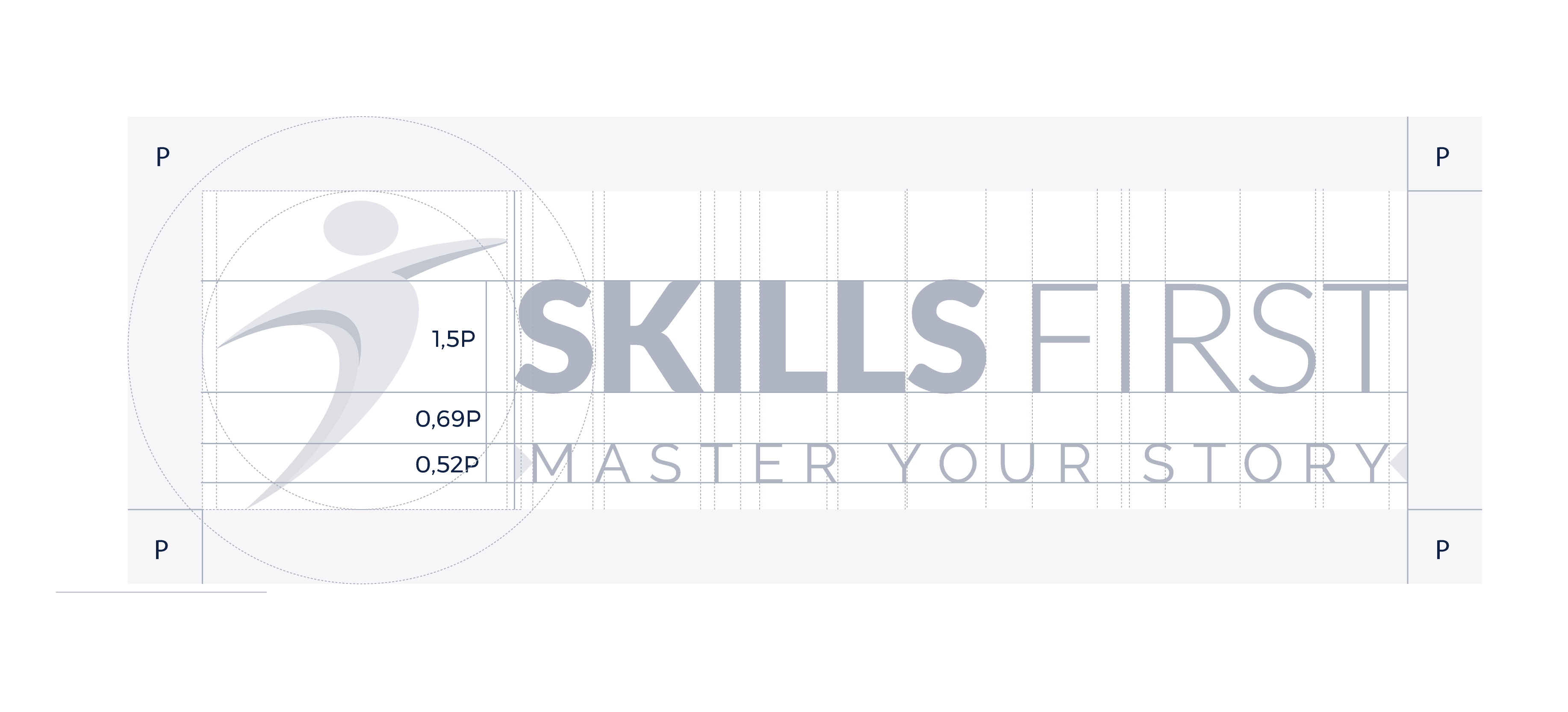
1.1.1. Basic logo
Can be used in all advertising materials, both digital and printed
Minimum height of regular logo:
9pt - printed without tagline, 100px - digital without tagline
20pt - printed with tagline, 150px - digital with tagline


1.1.2. Basic logo - negative version
Use on dark backgrounds


1.1.3. Signet version
It should be used on all advertising gadgets, wherever the print area is small. Can be used in all advertising materials, both digital and printed. For reinforcing branding. Also as web favicon and social profiles avatar.
Minimum height of signet: 6pt - printed, 50px - digital


1.1.4. Logo construction

1.1.5. Logo color palette
Basic version
Blue Zodiac
CMYK: 99, 88, 42, 45RGB: 16, 35, 71
HEX: #102347
Royal Blue
CMYK: 80, 66, 0, 0RGB: 38, 96, 227
HEX: #355EDF
Fire Engine Red
CMYK: 10, 95, 100, 0RGB: 214, 52, 28
HEX: #D72D24
Gray version
Oslo Gray
CMYK: 52, 39, 34, 3RGB: 130, 138, 147
HEX: #828A93
Ghost
CMYK: 24, 17, 16, 0RGB: 192, 196, 200
HEX: #C0C4C8
White Lilac
CMYK: 8, 5, 5, 0RGB: 230, 232, 233
HEX: #E6E8E9
1.2. Fonts
We use two Poppins font typefaces under the Open Font License. You should download if you want to use editable versions of our materials.
1.3. Design language
We take full advantage of the contemporary language of graphic communication - in icons, illustrations or patterns we use minimalistic forms. Our layouts are bright, the colors are clean without any rubbing or discoloration. We use mainly monocolor graphics without strong accents, based on two - three main colors.
1.3.1. Icons, illustrations, accents
All graphic elements focus on communicating tools and functionalities, ensuring clarity and intuitiveness, while avoiding literal representations.
1.3.2. Color palette
The color base uses gradient sets, adding depth and a modern touch. The marketing materials explore various gradient combinations, creating visual interest. Below are some sample sets.
Ultramarine Blue + Bay of Many
HEX:#5E77FF +
#2F2F88
White + Faded Blue
HEX:#FFFFFF +
#7684FF
Ultramarine Blue + Sweet Pink + Remy
HEX:#546AFF +
#F09A8C +
#F8DBD6
Ultramarine Blue + Orchid + Rose Fog
HEX:#5867F3 +
#E4AADA +
#E8BDB3
Medium Slate Blue + Pear
HEX:#6C5DFB +
#D3E629
Ultramarine Blue + Medium Turquoise + Ice Cold
HEX:#4859F6 +
#4CCECD +
#A6FDE8